- Asymptote does have a graphing library, and it would be nice to not have to learn yet another tool. However, I couldn't see how I could make it format things in the way I'd like. For example, I'd like my histogram to have labels showing the range of values for each bin. I think Asymptote is outstanding as a tool for general technical drawing, and it can certainly do graphing, but creating histograms, bar charts, and dot plots, I think that specialized tools (such as those below) will be more effective.
- http://matplotlib.org/ - a python library
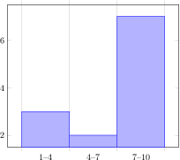
- http://pgfplots.sourceforge.net/
- creates histograms, box plots (shown in section 5.9.1 of the manual and in this question on tex.stackexchange).
- Getting dotplots in the format I'd like will take some doing... you basically use the scatterplot function to stack dots on top of each other. Should probably move the x-axis labels further down, remove the y-axis labels, and obviously add a point at (2,2), but you get the general idea:

- It is possible to create a PDF that contains just the plot, using the directions in 7.1.2 of the manual: "Using the Externalization Framework of PGF 'By Hand'."
- R -
- Easy to export R graphs to PDF or PNG, though I was thrown off by the fact that some code that works to export to an PNG when executing line-by-line doesn't work when executing within a loop (see the ggplot2 section here)
- When I tried to the image smaller, I ended up with a funny image where the fonts were disproportionately large. I'm not sure how much effort would be necessary to fix this.

- The ggplot2 package does have a nice dotplot feature... with very little futzing I was able to produce this:

- I want to write a loop that will create a whole bunch of random plots and write the related information (mean, median, range) to the database. It took me a while to figure out how to configure the ODBC database connection to MySQL - you have to make sure that everything is either 32-bit or 64-bit, otherwise R throws the error: [RODBC] ERROR: state IM014, code 0, message [Microsoft][ODBC Driver Manager] The specified DSN contains an architecture mismatch between the Driver and Application.
Decision: In the end I think pgfplots is the quickest way to produce nicely formatted images of the desired size.
No comments:
Post a Comment
Note: Only a member of this blog may post a comment.